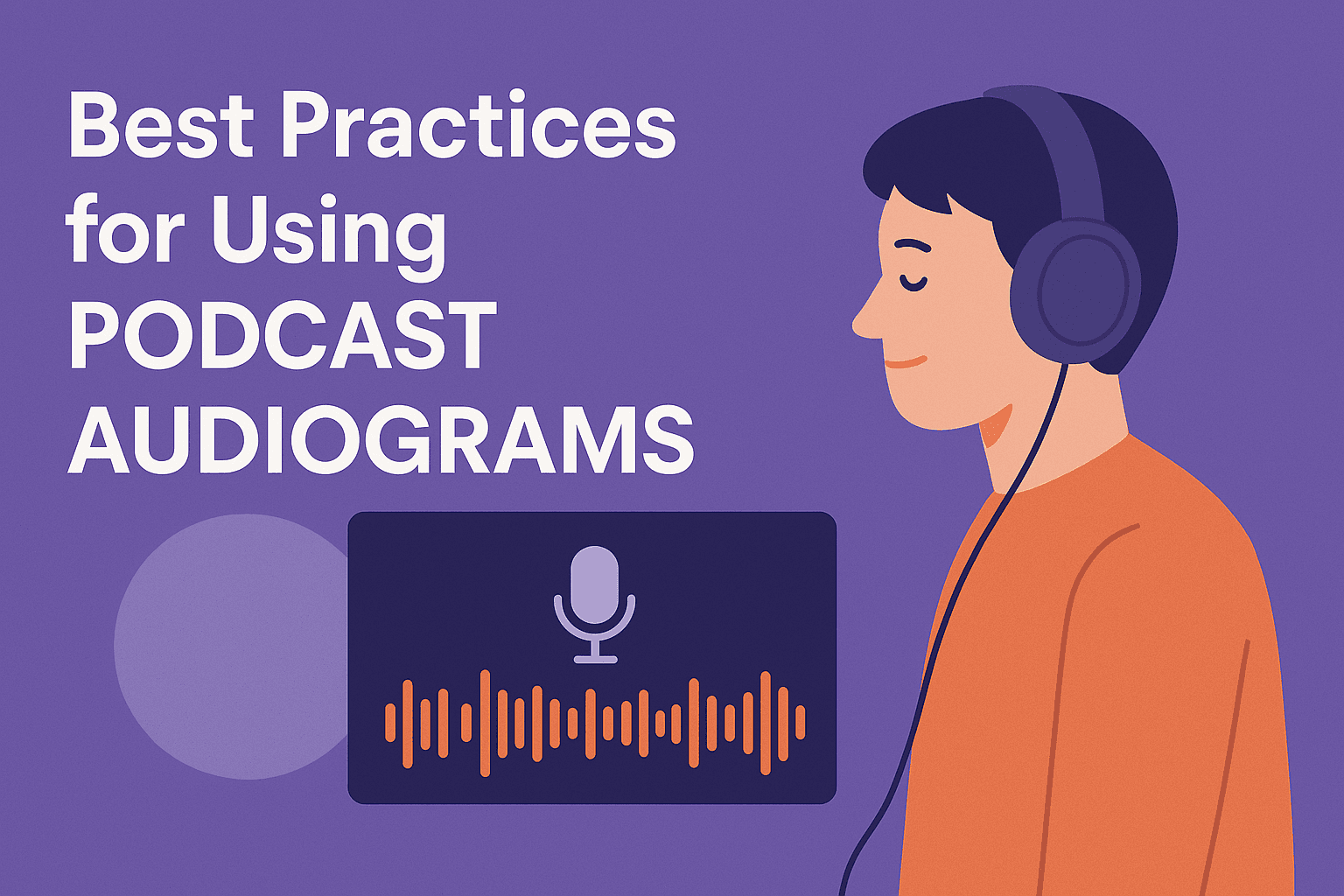
The Dos and Don'ts of Podcast Audiogram Design
Learn the most important podcast audiogram design dos and don'ts for captions, layout, branding, and mobile readability.
A podcast audiogram can have a great clip and still underperform if the design is hard to read, badly paced, or cluttered.
Good audiogram design is not about making the video flashy. It is about making the message easy to notice, easy to understand, and easy to remember in a fast-moving feed.
If you are still comparing platforms before you lock in the design workflow, read Best Audiogram Maker Tools for Podcasters.
What makes a good podcast audiogram?
A good audiogram does four things well:
- shows a strong hook quickly
- keeps captions readable on mobile
- makes the brand recognizable without overwhelming the content
- supports the audio instead of distracting from it
If any of those fail, the clip usually feels weaker than it should.
The dos of podcast audiogram design
Do choose the clip before the design
Design cannot rescue a weak clip. Start with a segment that has:
- a clear point
- a strong first line
- one emotion or idea worth sharing
The design works best when the content already earns attention.
Do prioritize caption readability
Captions are usually the most important design element in an audiogram.
Make them:
- large enough for mobile
- high contrast against the background
- short enough to read quickly
- synced tightly to the spoken words
If your captions are hard to read, the rest of the design barely matters.
Do use movement with restraint
Waveforms, subtle animation, and small transitions help the clip feel alive. But they should support the content, not compete with it.
A waveform should guide the eye, not become the whole point of the visual.
Do keep branding consistent
Your colors, fonts, logo treatment, and layout should feel like the same brand every time. Consistency is what helps viewers recognize your content in-feed.
Do design for the platform
Audiograms should match where they will actually be posted.
- vertical for Reels, TikTok, and Shorts
- square when the workflow is feed-first
- horizontal only when the platform and placement support it
The don’ts of podcast audiogram design
Don’t overload the screen with text
An audiogram is not a slide deck. If the viewer has to read too much, they will keep scrolling.
Keep only the text that helps the clip land:
- captions
- one short title or hook if needed
- minimal branding
Don’t use busy backgrounds
Complex backgrounds make captions harder to read and pull focus away from the actual message. Clean backgrounds usually perform better.
Don’t put important elements in unsafe areas
Platform UI can cover parts of the video, especially near the top and bottom edges. Keep captions, logos, and key text inside safe zones.
Don’t make the waveform the hero if the words are the real value
Many weak audiograms overemphasize the waveform and underemphasize the spoken content. The waveform is support, not the main attraction.
If you are specifically comparing waveform-focused tools rather than full audiogram workflows, continue with Top Waveform Generator Tools.
Don’t publish without previewing on mobile
Desktop preview is not enough. Audiograms are mostly consumed on phones, so mobile readability is the real test.
A simple audiogram design checklist
Before publishing, check these:
- the first line is strong
- captions are readable on a phone
- the title or hook is short
- logo placement is subtle
- waveform animation is not distracting
- safe zones are respected
- the design still works with audio muted
If those are all true, the audiogram is usually in good shape.
What strong audiogram design usually looks like
The best-performing audiograms are often simpler than people expect.
They usually have:
- one speaker focus or one clear quote
- one main visual frame
- clean captions
- subtle motion
- limited color usage
The more moving pieces you add, the more chances you create for confusion.
How Recast fits
This is a strong Recast workflow because audiogram design is not just about exporting a waveform. It is about making repeatable assets that look right every time.
Recast’s podcast audiogram generator is useful here because it combines:
- waveform visuals
- caption generation
- brand styling
- multiple aspect ratios
- reusable templates
That means your team can build a cleaner design system instead of redesigning every clip from scratch.
Common design mistakes teams repeat
Designing for desktop instead of mobile
The preview might look fine on a large screen and fail completely in the feed.
Using too many visual elements
Extra effects often reduce clarity instead of improving performance.
Treating every platform the same
What works in a square LinkedIn post may not work in a full-screen vertical reel.
Forgetting that muted viewing is normal
If the clip only works when sound is on, the design is incomplete.
FAQ
What is the most important part of audiogram design?
Usually caption readability. If the viewer cannot quickly understand the spoken content, the clip loses most of its value.
Should podcast audiograms always be vertical?
Not always, but vertical is usually the best default for short-form social platforms. Square can still work well for some feed-first use cases.
How much branding should an audiogram have?
Enough to be recognizable, not so much that it distracts from the clip. Strong branding is usually subtle and consistent.
Can Recast help with audiogram design?
Yes. Recast helps with captions, waveform visuals, reusable templates, and platform-ready exports, which makes audiogram design much more repeatable.
If you want cleaner, more consistent podcast audiograms, start with Recast’s Audiogram Generator or browse the audiogram templates.