Podcasting

Creating Podcast Cover Art: A Guide

Apple Podcasts requirements for podcast cover design include 3000x3000 pixels, 72 dpi, JPG or PNG, RGB colorspace.

Nov 14, 2024

Ever wondered, in the sea of podcasts flooding the internet, what makes The Joe Rogan Experience consistently popular in the United States? It's not just Joe Rogan's engaging conversations or high-profile guests, it's also his instantly recognizable podcast cover design. Rogan nails right from the main cover art to each episode's cover designs that are scroll-stopping, communicating with listeners about what's in store, who the guest is, and what they don't want to miss out on.

Your podcast cover design is an excellent marketing tool that captures your audience's attention and boosts your podcast reach. In this guide, we'll explore how creating an eye-catching podcast cover design can increase clicks, build brand credibility, and put your show on top.

Importance of Podcast Cover Art

A compelling podcast cover can differentiate your show in a crowded marketplace and indicate professionalism and credibility from the outset. Here are some reasons why podcast cover art is essential and how it impacts your listeners: 

  1. Impact on Potential Listeners and First Impressions

Your podcast cover art is the one that sparks curiosity to a potential listener, making it a deciding factor in whether they click to learn more about your podcast. Just as a book's cover entices readers, a podcast's cover shows the distinct personality of your podcast.

  1. Association with Podcast Quality

The eye-catching, high-quality, and well-designed cover design shows a polished podcast setting great expectations before anyone even listens. If the podcast cover art looks polished, people assume the content will also be well-crafted.

  1. Influence on New Listener Attraction

A compelling podcast cover design can distinguish your podcast from a vast sea of shows. According to Buzzsprout, 62% of new listeners are likelier to listen if they like podcast cover art. So, eye-catching cover art can lead to more clicks, subscriptions, and a growing audience. 

Let’s see some guidelines and specifications that need to be followed for creating a stand out podcast cover. 

Guidelines and Specifications

Following standard guidelines for podcast cover art is crucial to make your cover clear, professional and engaging across all devices. In addition to technical requirements, proper sizing, resolution, and format are essential for making podcasts comply with platform standards for a great listening experience. 

  1. Apple Podcast Requirements

For Apple Podcasts, the platform requires a cover art size of 3000x3000 pixels at 72dpi, in either JPG or PNG format, using the RGB color space. If you submit your podcast using an RSS feed, the size ranges from 1400x1400 to 3000x3000 pixels. Meeting these specifications ensures your podcast looks best on different devices.

  1. Importance of Meeting Size, Resolution, and Format Requirements

About 73% of weekly podcast listeners use smartphones, so the cover art should look good on small screens. Large platforms like Apple prioritize proper sizing, ensuring your cover art looks good on all screen sizes. So, meeting the size, resolution, and format guidelines is crucial.

  1. Consequences of Not Adhering to Guidelines

The two main adverse effects of ignoring these guidelines are platform rejection and pixelated visuals. Meeting each specification is essential for getting your podcast accepted among all platforms and providing a professional experience.  

Now that you know the technical specifications, let’s explore design principles that will help you create eye-catching and captivating podcast cover art.

Design Principles

When creating a podcast cover art, following the design principles is crucial to make your cover art attractive and functional. A well-designed cover conveys your podcast’s theme and purpose. Here are a few design principles to follow while creating a podcast cover:

  1. Clear Communication of Podcast Subject

Your cover art is something a listener sees at first glance, so convey what your podcast is all about. Using minimal text and bold visuals can effectively capture your show's theme. However, always ensure you do not overdo things like adding too many elements. 

For example, if you run a health and wellness podcast, soft greens, calming blues, or pastel colors would go well, giving your audience a soothing vibe and showcasing your focus on health, mindfulness, or wellness topics.

  1. Limiting Word Count to Seven

Avoid writing so many texts, and always keep the text short and meaningful. A title and subtitle should not exceed more than seven words. This ensures readability and retains focus. Including many texts may clutter the design and make it difficult to read at a glance. Especially on smaller screens, a cover art with more than seven words may look disorganized. 

  1. Avoid Explicit Language and Imagery

Many platforms forbid explicit visuals or language in cover art, ensuring it is kept clean for broader reach. Without crossing these boundaries, think of ways to convey your podcast's theme and purpose appealingly. 

  1. Utilize Appropriate and Legible Typography

As podcast cover art tends to shrink based on the screen size, choosing suitable font choices is crucial. Make sure the fonts you use remain readable even at small screen sizes. Aim for fonts that go well with your podcast theme and other visuals in your cover art. 

With these design principles in mind, let’s now dive into the specific design components that can improve the visual appeal of your podcast cover art.

Design Elements and Aesthetics

Balancing each design element ensures that your cover art looks fantastic and memorable, conveying the concept of your show. Here are some tips to balance your design elements:

  1. Appropriate Color Usage and Contrast

Choosing colors and contrast that show your podcast's theme is crucial. Choosing high contrast between text and background improves the readability of your cover art. 

For example: For a technology podcast, consider using:

  • Futuristic fonts

  • Gadget icons

  • Bright neon colors to appeal to a tech-savvy audience.  

  1. Avoid Cliches like Microphone Imagery

We know most podcast cover art has images or visuals of the microphone, making it very obvious and boring. But to stand out in the sea of podcasts, use visuals that reflect your podcast niche and avoid cliches. 

By choosing visuals that are unique and aligned with your theme, capture your listeners attention.

For example, one of the top 10 podcasts in the United States, Storytime with K - Kid Story Podcast's cover art for each episode conveys the visuals of the story that is spoken, driving more engagement. 

  1. Maintain Consistent Branding with Type and Colors

Building a podcast that stays memorable starts with a signature look, something that listeners recognize instantly. Using the same colors and fonts across episodes creates a visual identity for your podcast, like joining each puzzle piece. 

Using different fonts and colors on each episode's cover art makes for a poor brand representation.  

  1. Blend Typography with Imagery Effectively

In podcast covers, words and pictures must perform like a perfect duet. Your title may be overlooked if your images take center stage. Additionally, the image may seem secondary if the text is too dominant. 

Try adding text to the image's negative space, applying overlays, or applying delicate shadows. This way, your font can "speak" to your readers without overpowering the images.

After learning the basic components of design, it’s time to look into tools that can effectively develop your creative ideas. 

Tools for Creating Podcast Cover Art

Many tools are available in today's digital space, from paid to free versions, to create your podcast cover art. However, choosing the right tools that align with your needs is crucial. Here are some design tools and the features they offer:

  1. Recast Studio

  • Recast Studio’s AI-powered cover art generator specifically designed for podcast covers.

  • Editable templates that facilitate the creation of polished, high-quality artwork.

  • Easy-to-use interface that doesn’t require advanced design knowledge and is perfect for fast modifications.

  • It Enables text, color, and image customization for consistent branding.

  1. Canva

  • Drag-and-drop design features appropriate for users of all levels.

  • It Provides a collection of podcast cover design elements and templates.

  • It offers simple modification choices. However, it does not have advanced editing capabilities.

  1. Adobe Creative Suite (Photoshop, Illustrator)

  • Advanced expert tools for experienced designers.

  • A wide range of high-level customization tools include vector editing and layering.

  • It has a steeper learning curve but is ideal for people who want fine-grained control over their design. 

Now that you are aware of the resources, let’s see a detailed step-by-step guide on how to make your own podcast cover art with Recast Studio.

How to Create a Podcast Cover Art Using Recast Studio

Step 1: Start with a Template

After signing up, click the “New Project” button and choose from a collection of AI-powered templates from Recast Studio’s dashboard.

Step 2: Customize Text and Colors

Add your podcast's title and subtitle to your template, and adjust the colors to match your podcast's vibe. You can also change any color or text in the AI-generated template, thus enabling you to create a podcast cover of your aesthetics. 

Step 3: Add Relevant Imagery

Recast Studio provides a library of images to choose from, and you can also upload your own from a desktop, Google Drive, or any cloud. Select visuals that reflect your podcast theme and appeal to your listeners. 

Step 4: Adjust and Finalize

You can preview your design and make any adjustments to ensure it is readable and aesthetically pleasing across all platforms and to see how it appears on various devices.

Now that you have podcast cover art created with Recast Studio, it’s critical to follow a few best practices to make sure your cover appeals to your listeners and stands out on all platforms and devices. 

Avoiding Common Pitfalls

When starting a new podcast, some common pitfalls people usually make and that need to be addressed. Here are some pitfalls to avoid:

  1. Avoid complexity and ensure clarity

Complex designs containing too many visuals and colors can confuse listeners or get muddled on small screens. Simple and precise designs are always more effective, allowing key elements to shine without overwhelming the eye.

Source: spotify.com

Example: Think about The Minimalists podcast cover design. Their cover design is straightforward, with just white text on a black background, yet it communicates their focus on minimalism.

  1. Optimize for various platform sizes

Your podcast cover art appears in different sizes on platforms like Spotify, Apple Podcasts, and other apps. So, designing and optimizing your podcast for various screen sizes and platforms is crucial to stand out.

Source: spotify.com

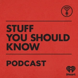
Example: Think about Stuff You Should Know podcast's cover design. Their design is highly adaptable with clear typography and a simple yet very distinct red and black color scheme, making their cover stand out in all screen sizes. 

  1. Checking for mobile readability and adjusting accordingly

Nowadays, many listeners discover podcasts on mobile devices where screens are smaller. So avoid using thin or excessively artistic fonts that can blur or become difficult to read at smaller sizes, and ensure the text on your cover image is readable at a glance.

Source: spotify.com

Example: The Daily by The New York Times podcast has large, readable fonts and a high-contrast design suitable for small screens. Their cover's use of a striking color block and simple, readable font makes it instantly recognized and easily recognizable at any size, making it mobile-friendly.

Conclusion

Having a podcast cover art is not just a visual. It's your first chance to impress your potential listeners. A great podcast cover art showcases your brand and communicates the purpose of your show. To set your podcast up for success right from the beginning, focusing on clarity, design principles, and consistency is crucial.

You don't need to be a professional designer to make your cover art shine. Recast Studio's AI-powered podcast cover art generator offers you all the tools to create compelling and professional cover designs effortlessly. Recast Studio is your quick way to make unique cover art, whether you are introducing a new show or updating an existing cover. 

Are you prepared to grab your listeners' attention right away? Try Recast Studio's free trial now to see how your podcast cover goes from basic to brilliant!

AI-powered Video Editor for marketing teams

Transcript based editing

Audiogram Maker

AI Show Notes

AI Clips & Shorts

And More...

AI-powered Video Editor for marketing teams

Transcript based editing

Audiogram Maker

AI Show Notes

AI Clips & Shorts

And More...

AI-powered Video Editor for marketing teams

Transcript based editing

Audiogram Maker

AI Show Notes

AI Clips & Shorts

And More...

Ai Powered

Marketing Assistant for Your Podcast

A generative AI tool that automatically turns your podcast episode into short video clips & writes show notes, blog posts, social media posts and more in minutes.